Your Data Is Trapped in Spreadsheets and PDFs. Get Instant Insights.
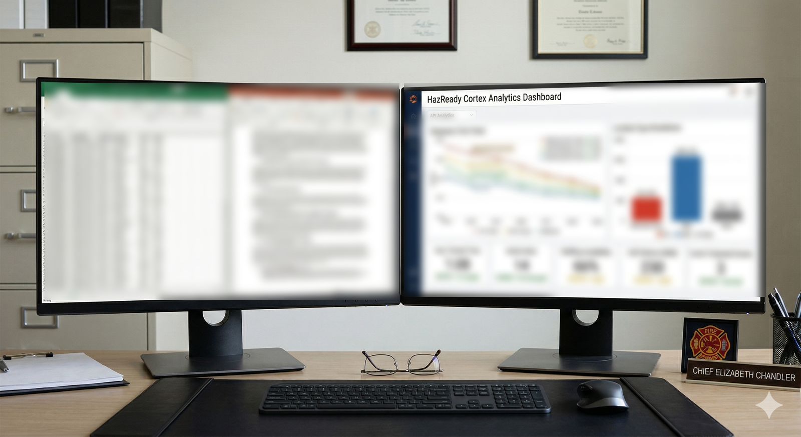
Every fire agency has data: training records, fleet maintenance logs, call volumes, budget spend, personnel experience, equipment inventory, call response times. This data lives in spreadsheets. Files stored on someone's computer. Maybe three versions of the same spreadsheet in different folders because nobody cleaned them up. When council asks for a budget justification, you manually export data and build a presentation. When accreditation asks for training compliance metrics, you spend a day gathering information from four different spreadsheets. When you want to understand why response times are increasing, you don't look at your data. You guess based on what you remember.
You're sitting on insight and pretending you don't have it. The problem isn't that your data is bad. It's that extracting insight from spreadsheets requires someone with analytics expertise and time nobody has.
Why Existing Approaches Fall Short
Basic spreadsheet analysis is slow, error-prone, and one-person-dependent. Business intelligence tools exist, but they cost thousands to buy and require expertise to implement and maintain. You need IT support. You need someone trained. And agencies are often quoted a separate fee by their own records or data system provider simply to get their data back out in a usable format.
So data stays in spreadsheets. When you need a number, someone hunts for the right file, hopes it's current, and manually pulls information. When you find a mistake, nobody knows if it affects other analyses. When a key person leaves, nobody knows how the spreadsheet was constructed or whether it's even trustworthy.
What It Looks Like in Practice
It's budget cycle, and the fire chief needs to justify why she needs two new firefighters. She has data scattered across three spreadsheets: call volumes over the past three years, response time trends, training hours per person, and overtime data. Normally, this means manually copying information into a presentation and hoping the narrative holds together.
Instead, she uploads all three spreadsheets to Cortex Analytics. In seconds, she has an interactive dashboard showing call volume growth month by month (calls up 18% year-over-year), response time trends by area (slower in the southeast), average training hours per person (down 12% because of understaffing), and overtime patterns (peak periods predictable, correlating with holiday coverage and summer vacations). She can filter by station, by shift, by incident type. She can generate a council-ready report that shows the data correlation between understaffing and response time impact.
It took her 20 minutes instead of three hours, and the data is defensible because it's transparent and interactive. Council can see the underlying numbers. She's not asking them to believe her narrative. She's showing them the data.
A month later, an accreditation self-assessment requires training compliance metrics. Her training officer uploads the training database. The system generates a dashboard showing training completion by competency area, trending over three years, compliance gaps by station or shift. She can see that rope rescue training is at 65% compliance and see exactly which people need training.
Three months later, a captain is wondering why one station's equipment maintenance budget is 30% higher than the equivalent station across town. She uploads fleet maintenance records. The dashboard shows age-of-vehicles by station, maintenance incidents over time, and cost per vehicle. It becomes immediately obvious that the station's vehicles are five years older on average, which explains the higher maintenance spend. She can now have a data-driven conversation about fleet replacement instead of guessing.
What This Means for Your Agency
For fire chiefs and emergency managers: you have data-driven answers to budget questions, accreditation questions, and operational questions. You upload a spreadsheet and get a dashboard.
For budget and council: your funding requests are backed by transparent data that can be examined. You're showing them the numbers, not asking them to trust your narrative.
For accreditation and compliance: you have documented metrics that prove training completion, response capability, and operational efficiency.
For operational planning: you can see trends in call volume, response times, and resource utilization. You make decisions based on actual patterns, not memory.
"Data is only valuable if you can see it. Spreadsheets hide it. A dashboard reveals it."
See HazReady on your jurisdiction
Every agency has its own procedures, hazards, and mutual aid picture. The quickest way to tell whether this fits yours is to see it working against your own material rather than a generic demo. Book a walkthrough for your agency.